Thursday 30 September 2010

Short Film Analysis

Documentary Analysis
We decided to look specifically at documentary's,
to gain a better understanding of what makes them successful
so we could incorperate some of the genre specific
conventions into our own short films:


My Big Fat Gypsy Wedding:
· The documentary generally portrays a younger demographic around 18-24 years old women. It is aimed at a younger audience as they would be more likely to relate to the age group being shown.
· The cast of the documentary is predominantly women and would attract them more than it would men to view the programme.
· The traveller community would also take a wide interest in the show as it is showing their community and they would want to see how they are being portrayed to the public.
· The location generally consisted of the wedding planner’s workplace as she made the calls to get venues, and worked with the brides to create their wedding.
· Many high angle shots are used in the church to show an overview of the ceremony. Panning and tracking shots were used to show the entirety of the wedding reception venue.


Katie: My Beautiful Face
· Wide audience appeal but with a female lead focus, the documentaries audience is more targeted at women.
· Night vision shots were used to film Katie as she was sleeping and waking up various times in the night from night trauma. Extreme close ups were used to accentuate the extent of the damage done to her face after the acid attack.
· The mise en scene was predominantly with the hospital Katie recovered within. This was very appropriate and true to the documentary as it focused on the reconstruction of her face, and life after the attack.


Documentary Analysis

Documentary is way of presenting factual material which spans film television, radio, theatre, and the press.
Documentary presents actual incidents and statements which can be tested against reality. Documentary has changed and developed throughout the history of film and tv, in tv it overlaps with categories such as currents affairs and news. In the history of film, the documentary offers an alternative to the fictional world created characters and clear narrative shape for film. QUOTE:the documentary is distinguished from the factual film by its socipolitical purpose. Great art can be an instrument for social influence and change. The documentary film does have this purpose. Unlike films with a fictional narrative, documentarys rarely are intended for entertainment only, they usually contain messages of educational, social and/or political importance.
Documentary films include: in the name of the father
Forms and conventions of a documentary
Documentary is way of speaking about the world. It cannot be tied down to specifics of character and storyline in the same way as a genre can. It is typified by:
· Natural lighting-to give a more authentic documentary feel to it-separates a documentary from Hollywood cinema
· Indistinct town
· Jerky camera movements-tripod sometimes not used

These forms and conventions can chage as new technologies are constantly being developed. The term ‘actuality’ is used to describe the shots of actual footage as they happened. The event would have taken place wether the camera was there or not. The term ‘fly on the wall’ filming is leaving the camera in an specific area for a length of time and the editing it later and incorporating it into the rest the documentary.
Film images are selected for their use in illustrating and evidencing an argument.
Voice over: the voice-over has a role of uncovering, solving a mystery and/or telling a story. It can be used to record thoughts, it can also be used by a narrator, who has specific knowledge and is shaing with the audience, it can have a ‘god-like’ quality to it.
Written text:the term documentary implies that what is presented is linked to written documents. Many use subtitles, reference to time and place, and the appearance with written documents in the frame.


Film analysis 1:

Film analysis 2:

fim 3:

film 4:
Teeth
View more presentations from JoeRobert.

film 5:
Snap
View more presentations from JoeRobert.

film 6:

film 7:

film 8:

Poster Analysis


Poster Analysis
After analysing many posters from films of all different genres, I decided; as we specifically want to look into the Documentary Genre, that we analysed 12 different Documentary Posters to give us insight into the typical conventions of a Documentary poster. This could then support us when we start to produce our ancillary tasks. We have realised that image is very important and to produce a successful poster the image needs to be effective, and also the text that goes with it needs to be bold, so it visually appeals to the reader.


Poster analysis of many different genres.


The characters are pictured in comedic poses, which are very cheesy and obvious, not using much subtlety anywhere. It uses bright contrasting colours throughout, black/white, blue/orange – cheerful colours. The title is quite comedic as it has Mike Myers head as the O in LOVE, the type is white with an orange outline in bold bubble writing. “His karma is huge” is the quote written along the bottom of the image, obvious innuendo, and tells the themes of the film and the kind of comedy used. Famous people’s names who are in the film are written largely to persuade the audience to see it. Its audience would consist of teenagers young adults and fans of the characters involved. Religious shapes are carefully used along the top of the image there is a wiggly line made to look like the top of a cathedral.


This film is from the horror genre so uses a cold dark and scary colour scheme of blue, black, purple, grey and white. The main characters are sitting at the front of the image looking scared, huddled together for safety and support. The city is behind them distorted and in dark scary colours for dramatic effect. The quote from the film is “we’ve sensed it. We’ve seen the signs. And now... it’s happening.” This suggests the mystery in the film and makes the audience want to know more. The typography used is thin white and very simplistic. The white contrasts against the black behind it and brings the poster together by reflecting the whiteness in the background. The credits, institution and certificate is all listed below in white type. The image used shows the films genre themes, characters and setting i think its a good picture to choose to represent the film, and should attract its audience well. Its audience would be fans of horror films, most ages apart from children as they might find it too scary.


The main image is a black and white, medium shot of what is assumed to be the main character in the film, played by Matt Damon. The films title and other writing has been placed on his shoulder. The typography is in white and a greenish yellow which stands out against the black of his t-shirt. This colour scheme suggests the film is serious and aimed at a male audience. The title is bold and in capital letters so it makes an impact. All the credits, Certificate and its institutional reference are listed in small type below the title and films quote. “Chief Warrant officer Roy Miller is done with following orders” this use of language sounds quite common and masculine as though its said by a strong and assertive character. Its target audience would probably be male and people who are fans of the action thriller hybrid genre.


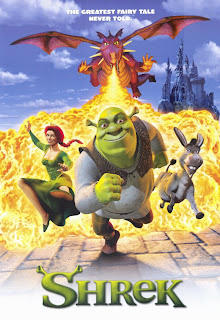
“The greatest fairytale never told” is how the film describes itself. This description connotes an unrealistic narrative with a happy ending, and “never told” suggests it might be a bit quirky and untraditional. The colour scheme used is very bright in clashing colours to grab attention. The main image is very bold and mythical, with an ogre, a Dragon, a donkey and a princess, with a bright blue sky, fairytale castle and fire in the background. The title is creative and unusual and reflects who is assumabley the main character. The main image reflects the film by showing the characters, setting, themes and hilarity present in the film. It’s target audience would probably be children and families who like fairytales or animated films with comedy.

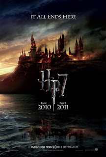
The main image in this poster is of Hogwarts castle under attack crumbling and flaming into the bleak sky. “It all ends here” is written in script at the top of the picture in illuminated in white against the dark sky behind. The colours used suggest death and hopelessness, although the light in the horizon could suggest the ending might not be as bleak as first assumed? The title is written in old fashioned style 3D type “HP7” Then in smaller typography below “Part 1” and then “Part 2” either side of the P’s tail which is in a zigzag. The credits and institutional references and release date are all listed at the bottom of the poster in the same typography style used above, to great effect. The main image reflects the film by showing the audience a glimpse of what’s to come in the films climax without giving away the plot its also a very intriguing and mysterious image that makes you want to know more. It’s target audience would be children teenagers and some adults.


It’s advertised as a traditional chick flick, attractive man, pretty woman playfully romantic pose with a girly colour choice. It has a basic layout which looks very effective in its simplicity. It has an extremely feminine colour scheme of white, pink and black which would be eye catching for passers by. the main image suggests romance and reveal its genre as a romantic comedy. It’s title is very bold and pink the font is sideways which makes the poster as a whole aesthetically pleasing. “She walked off the street, into his life and stole his heart.” is how the film is described, which builds on its romantic and happy themes. The main image reflects the film by showing the famous actors involved along with both their names written in black above he films title. Its target audience would be women, teenagers and adults.