Poster Analysis
After analysing many posters from films of all different genres, I decided; as we specifically want to look into the Documentary Genre, that we analysed 12 different Documentary Posters to give us insight into the typical conventions of a Documentary poster. This could then support us when we start to produce our ancillary tasks. We have realised that image is very important and to produce a successful poster the image needs to be effective, and also the text that goes with it needs to be bold, so it visually appeals to the reader.
Poster analysis of many different genres.
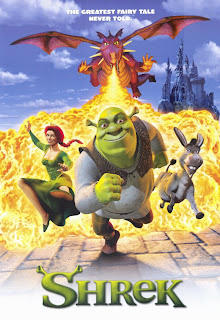
The characters are pictured in comedic poses, which are very cheesy and obvious, not using much subtlety anywhere. It uses bright contrasting colours throughout, black/white, blue/orange – cheerful colours. The title is quite comedic as it has Mike Myers head as the O in LOVE, the type is white with an orange outline in bold bubble writing. “His karma is huge” is the quote written along the bottom of the image, obvious innuendo, and tells the themes of the film and the kind of comedy used. Famous people’s names who are in the film are written largely to persuade the audience to see it. Its audience would consist of teenagers young adults and fans of the characters involved. Religious shapes are carefully used along the top of the image there is a wiggly line made to look like the top of a cathedral.

This film is from the horror genre so uses a cold dark and scary colour scheme of blue, black, purple, grey and white. The main characters are sitting at the front of the image looking scared, huddled together for safety and support. The city is behind them distorted and in dark scary colours for dramatic effect. The quote from the film is “we’ve sensed it. We’ve seen the signs. And now... it’s happening.” This suggests the mystery in the film and makes the audience want to know more. The typography used is thin white and very simplistic. The white contrasts against the black behind it and brings the poster together by reflecting the whiteness in the background. The credits, institution and certificate is all listed below in white type. The image used shows the films genre themes, characters and setting i think its a good picture to choose to represent the film, and should attract its audience well. Its audience would be fans of horror films, most ages apart from children as they might find it too scary.


It’s advertised as a traditional chick flick, attractive man, pretty woman playfully romantic pose with a girly colour choice. It has a basic layout which looks very effective in its simplicity. It has an extremely feminine colour scheme of white, pink and black which would be eye catching for passers by. the main image suggests romance and reveal its genre as a romantic comedy. It’s title is very bold and pink the font is sideways which makes the poster as a whole aesthetically pleasing. “She walked off the street, into his life and stole his heart.” is how the film is described, which builds on its romantic and happy themes. The main image reflects the film by showing the famous actors involved along with both their names written in black above he films title. Its target audience would be women, teenagers and adults.


No comments:
Post a Comment